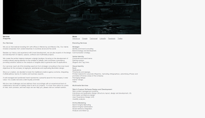
Firstly I took screen shots from Anagrama, a brand intelligence website. I like the use of white and grey tones through out the pages, this makes it easy on the eye as well as straightforward for navigating.
A great example of a fresh looking layout is the SiScott website, the designers work is presented in a clear way, the website is easy to use via the arrow tools, it has great use of white space and all text is legible. I will bare a grid system to use throughout my website.
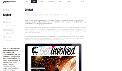
We are vapour provides an easy to use website, the composition of text and image is assembled well on each page, the information given is legible due to the simple colour scheme of black and white with coloured imagery. I also like the option to hover over and image to show the lower in opacity of the others to make the chosen one stand out before clicking.
I like the simple black and white text, the use of negative and small spacing. The content makes the designs look good not the designs make the website look good.
The illustrators website has themes of fashion, women squares and femininity through out. Its produced using cargo which is a quicker way of making a website as a posed to coding from scratch. I think the illustrators work is presented very well throughout the chose layout on the website.


No comments:
Post a Comment