Friday, 31 May 2013

PPP - Evaluation OUGD502


1. What skills have you developed through this module and how effectively do you think you have applied them?

The studio briefs that were set were very helpful, in particular Life's a pitch, Fred presented to us all the information we would need to know about setting up our own business. From this we got ourselves into groups and produced a design organisation, from working with other peers and researching aspects about a business set up I have learnt a lot in terms of costings, business and collaboration work. It was a great brief to work on because it made me consider what I should be doing through summer ready for third year, and a potential business is one i'd like to contemplate. A great skill I have learnt is how to communicate and collaborate with other individuals for work purposes. Each time I have worked with others on projects, the outcome has always been good and i've always been pleased with work produced, so this is something I will look forward to in third year and onwards. As a designer I believe I have improved my skills set in the adobe, however this is something I feel I have to practice with further. My researching skill have improved a lot over the past year, in comparison to last year we her I was unsure what was important and relevant to blog, I now feel I can gather information that will help me in projects. 

2. What approaches to/ methods of design production have you developed and how have they informed your design development process?

I feel I have progressed a lot since last year, my design abilities have enhanced and I want to keep going in that direction and progress further throughout third year. I have enjoyed experimenting with different materials throughout briefs in particular the Dazed and Confused brief which I collaborated with other art and design students for, taught me that I am capable of produce a body of work which full fills a brief and that I am really happy with. Whilst doing this brief I explored a lot in terms of design from photography, 3d type, graffiti, interior, installation and even event organising, doing this made me realise what kind of design direction I would like to explore through out the summer and third year. 


3. What strengths can you identify in your work and how have/will you capitalise on these?

Over all I can see an improvement in my software skills since being on the course and that is due to producing lot of digital based work, although I want to improve this further I have plans to explore a lot more with hand rendered and more practical based work to show a variety in my skill set. I can see a huge different in the style of work, although I don't have a specific one, I feel the over all appearance of my designs have massively improved from last year when I struggled to produce work that even resembled graphic design. I love photography and I have tried to incorporate it into as many briefs as possible this year as its an aspect of art which I love, I feel like I have done this quite well and I have liked the work from dong so, from this I have realised i am capable of work which I like doing but I need to push myself further to create work which is a challenge for me. 

4. What weaknesses can you identify in your work and how will you address these in the future?

My downfall this year has been due to bad time management, a problem which has to be over come before third year. I feel like my lack of organisation skills can bee seen in some of my work, for example finished and printed design which aren't photographed well, designs which I haven't left myself any time for improving or changing all together to full fill briefs, designs which are just printed due to not giving my self the planning and preparation time to do screen printing or process and finishes. This is something that has to change next year because I want the quantity and quality of my work to be a whole lot different to now. My biggest weakness is public speaking, it's a problem which is very frustrating and upsetting at times due to the fact I can't present to my peers confidently in crits and especially presentations, this is something I want to improve massively before heading into third year an industry because I feel like my nerves and presentation skills won't get me very far. 

5. Identify 5 things that you will do differently next time and what do you expect to gain from doing these?
Manage my time more effectively and be a more organised designer so that my work doesn't lack in quality or quantity.
Begin designing sooner to show a stronger development in ideas and to gain a more satisfied outcome when the products are finished. 
Experiment a lot more with processes and finishes to show a better collective of work.
Work more on creating good concepts and fulfilling all work that I want to achieve as a brief. 
Don't be lazy when designing, do all the things I set out to do not just the easiest/ last minute option. 

6. How would you grade yourself on the following areas:

Attendance: 3
Punctuality: 4
Motivation: 3
Commitment: 4
Quantity of work produced: 3
Quality of work produced: 3
Contribution to the group: 5

End of year presentation - Level 05


A design presence - Printed promo pack: LMB


A design presence - Creative CV: LMB

Here is the creative cv I have designed for mailing out to studios with hope to gain some recognition, some feedback on potential placement positions. Matching business cards would be in the pack too. Unfortunately I don't have a live website so that is something I will work on for to b able to link people when I email studios for queries. 


Thursday, 30 May 2013

A design presence - Website: LMB

www.lmbdesigns.co.uk would be the name of my website. 


Adapting the brand to be suited to web, keeping the initials and adding a simple circle. 


Keeping the brand consistent with the use of photography, and a straight forward black and white colour scheme for legibility for users. 


For the porfolio page on the website 


A design strategy - Branding and Identity: LMB

To show that my visual identity can be spread across a variety of products and still look consistent I have mocked up some stationary to show the verticality. 


Logo
Business cards
Letter head
Envelope
Notebook
Pens

A design presence - Business cards: LMB

Using the photograph I produced a series of business cards using a reflective image pattern.


Final business card designs:

A design presence - Self branding: LMB

_ Branding

Lisa Marina Burns
LMB

I thought a great starting point for branding would be to start working with my name and initials as a posed to creating a logo straight away. From this my initial thought for creating a visual identity for myself would be to use some of my photography work, I believe using imagery will show that i'm a fan of photography and I like to combine it with graphic design.

From my photography albums I selected an image which is a South East London cityscape image, an area where I used to live. The picture depicts colour, perspective, material and structure, all of which are aspects that can be applied into design.


I wanted to design a very simple logo just based on my initials, here is the strongest and most bold I produced using the Arial Black font. 


Adding illustrative details to the image made the photograph less realistic which I liked.


From here I experimented with type, font and layout to see how my logo was best composed. Although I like the idea of text as image, I was unsure whether I could apply this to a variety of products with it maintaining consistency. 


Business cards experiments, applying different fonts to each, over all I felt the Arial Black stood out most, and was most legible. 


Tuesday, 21 May 2013

Design strategy - Evaluation OUGD505


1. What skills have you developed through this module and how effectively do you think you have applied them?

I believe I have improved on the practical side of things a little, for example the ability to construct packaging well from a simple drawing to a three dimensional object, as maths isn't my strongest subject I think I have done quite well in designing and building designs. I am sure I have improved in the way I need to document my work throughly on my blog, I annotate and analytically comment about my work in an informative way, so I suppose this is a skill I am developing. I feel I have the ability to explore a variety of ideas before designing, previously I used to stick with one idea and create from there resulting in dead end designs. 

2. What approaches to/ methods of design production have you developed and how have they informed your design development process?

In terms of approaches to creating designs I believe my best asset is researching thoroughly, primary and secondary information helps a lot before beginning a design, it sets a foundation for what exactly I am going to create. For example in the what is good brief, my  'good' was Marc Jacobs perfumes, I gathered a wide range of information and found a lot of useful imagery to enable me to develop my own brand of perfume in sired by the research I had found.  


3. What strengths can you identify in your work and how have/will you capitalise on these?

Unfortunately when I observe my work I don't see many strengths in terms of designs, I feel quite disappointed with myself when evaluating the work as I believe I could have produce a better quality and quantity of work in the time that I had, and I believe the amount of research I had gathered for the brief shows what I could have produced product wise. Although this is a negative answer I do believe my ability to develop a good concept has improved in comparison to previous briefs. 

4. What weaknesses can you identify in your work and how will you address these in the future?

What is good was the one brief of the year that I thought I would enjoy and get most out of initially, regrettably I produced the least work for it due to bad organisation and time management throughout other briefs, which inevitably has been reflected in my work for this module. I can identify weaknesses in the quality of my work due to the stocks I used in final products and the formats I chose to apply. If I could do things differently with the 'What is good' brief I would develop a wider range of products such as perfume lotions, sprays etc as well as create the actual perfume bottle for the range. I would also produce more informative products, applying information about the range of fragrances I had produced. 

5. Identify 5 things that you will do differently next time and what do you expect to gain from doing these?
Manage my time more effectively and be a more organised designer so that my work doesn't lack in quality or quantity.
Begin designing sooner to show a stronger development in ideas and to gain a more satisfied outcome when the products are finished. 
Experiment a lot more with processes and finishes to show a better collective of work.
Work more on creating good concepts and fulfilling all work that I want to achieve as a brief. 
Don't be lazy when designing, do all the things I set out to do not just the easiest/ last minute option. 

6. How would you grade yourself on the following areas:

Attendance: 4
Punctuality: 3
Motivation: 3
Commitment: 4
Quantity of work produced: 3
Quality of work produced: 3
Contribution to the group: 5

Monday, 13 May 2013

Design strategy - Print Project Talk

Today I attended The Print Project talk in the lecture theatre, where a letter press designer and printer came in to discuss the ethics of letter press design. The presentation informed me about what letter press design was, how he produced his own work, what machinery was used to do so and how to go about buying his prints. I decided to look on the website provided to see what kind of work was is being produced. 

Heres is a print which was shown in the lecture, the colours look more vivid on stock as a posed to screen. The designer stated that "much of this reminds me of acid tabs".


The Cunningham Amendment.


Garage Grumbles: Guerrillas in the Garden

I’ve always taken an interest in Guerrilla Gardening. Once, in Blackburn, I was part of a team that wallpapered and painted a derelict bus stop in the wee hours of a Sunday morning. In Brighouse I left some flower pots in the midst of one of the town’s many concrete zones. As my bones grew older I took to litter-picking. It always struck me that the area around the 1in12 is crying out for environmental experiments.
Since coming down to Norfolk we have adopted a piece of wasteland. At some time in the past it had been a village garden. We’ve spent a good year by now, mowing and weeding and planting. It looks fine. The only problems we encounter have been the English diseases of litter and the fact that the motor car seems to trump every other value. We get vehicles parked up on there leaving tyre-tracks. If I see them I ask politely if they wouldn’t awfully mind moving on. Most apologise and drive off. Some don’t. As for litter I get out there most days with my picker-upper-sticker. It keeps me healthy. And just maybe, perhaps a busy motorist, whizzing off to work, catches a glimpse of this patch of ground and it may make them smile.

Source:http://theprintproject.co.uk

Friday, 3 May 2013

A design presence - Website research

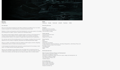
Firstly I took screen shots from Anagrama, a brand intelligence website. I like the use of white and grey tones through out the pages, this makes it easy on the eye as well as straightforward for navigating. 


A great example of a fresh looking layout is the SiScott website, the designers work is presented in a clear way, the website is easy to use via the arrow tools, it has great use of white space and all text is legible. I will bare a grid system to use throughout my website. 


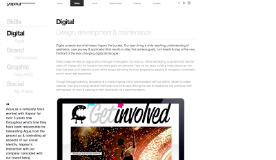
We are vapour provides an easy to use website, the composition of text and image is assembled well on each page, the information given is legible due to the simple colour scheme of black and white with coloured imagery. I also like the option to hover over and image to show the lower in opacity of the others to make the chosen one stand out before clicking. 


I like the simple black and white text, the use of negative and small spacing. The content makes the designs look good not the designs make the website look good. 


The illustrators website has themes of fashion, women squares and femininity through out. Its produced using cargo which is a quicker way of making a website as a posed to coding from scratch. I think the illustrators work is presented very well throughout the chose layout on the website.