Cocolobo
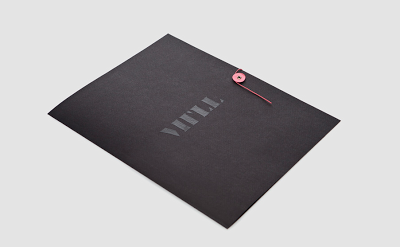
MTLL
Corporate branding
Leesa O’Reilly
Leesa O’Reilly, a stylist, recently expanded her business beyond photographic styling to include product sourcing and location scouting. Additionally, she has also launched a prop hire arm to her business of which all her unique products acquired over the years can be sourced.
Her brandmark is based on the idea that she is constantly sourcing objects from different places. We chose to produce four different business cards to show the diversity of her work and business.
Mulberry
Construct continue to work extensively for British design company Mulberry. Over the last 12 months, Construct has refined the original Mulberry logotype and the famous tree motif. This newly updated design has been applied across an extensive variety of applications including components that feature on all products, shop signage (in collaboration with Universal Design Studio), business stationery, a multitude of seasonal items and – most challenging of all – a huge gold inflatable Bayswater bag balloon.
Claridge’s
Construct remain heavily involved in the extensive rebrand of luxury Mayfair hotel Claridge’s. Recent work includes the design of menus for a variety of locations within the hotel, including the stunning Foyer and Reading Room, the Claridge’s Bar and the Fumoir.
To help new employees understand the history and grandeur of the place and the privilege of working in one of London’s finest hotels, Construct produced a brand book, given to new staff. Filled with facts and figures as well as inspirational quotes from Spencer Tracey to Tom Ford, the 12 page hand-sewn book has gold and black paper tip-ins. A gold foiled Claridge’s crest features through out.
Jacqueline Cullen
Designer, Jacqueline Cullen has developed innovative processes and formats that celebrate rather than disguise the inherent flaws and inclusions of Whitby jet (a black-as-night fossil of prehistoric trees). Construct crafted the identity and produced a toolkit comprising a variety of stamps (wax, embossing and ink) to reflect Jacqueline’s work.


No comments:
Post a Comment